

Boost Your App's User Experience with Responsive Layouts for Portrait and Landscape Modes with .NET MAUI
Respond to device orientation using styles and triggers


Introduction
When developing mobile apps user experience (UX) is key. Today, we will have a look at the role device orientation plays for user experience and how you can take advantage of .NET MAUI's built-in capabilities.
While Portrait mode has become the default mode for mobile apps, because we often stare at the screen while holding the device in one hand, it may be a good idea to offer a Landscape version of your User Interface (UI) as well. Landscape mode greatly increases the user experience of an app, because the screen width is just too small in Portrait mode when dealing with images, videos and other types of horizontally organized graphics and data. Landscape mode enables your users to view such information and data in a more user-friendly and orientation optimized way.
In this blog article, I will how you how to respond to the device orientation in your .NET MAUI app using state triggers and update the layout entirely in XAML markup - no C# code required. As always, you can find the full code for this post in my sample repository.
Note: The concepts in this article are largely applicable to Xamarin.Forms as well.
Portrait and Landscape
Let's have a look at the sample app, which I have extended with a page that displays a video (using the MediaElement from the Community Toolkit) and two custom buttons, one to play and another one to pause the video.
Portrait Mode:
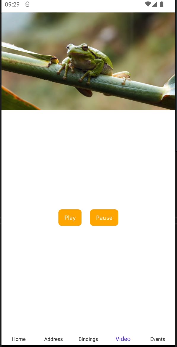
When the device is in Portrait mode, the page looks fine, the video takes up the entire width of the screen and the buttons are located below the video, as expected.
Landscape Mode:
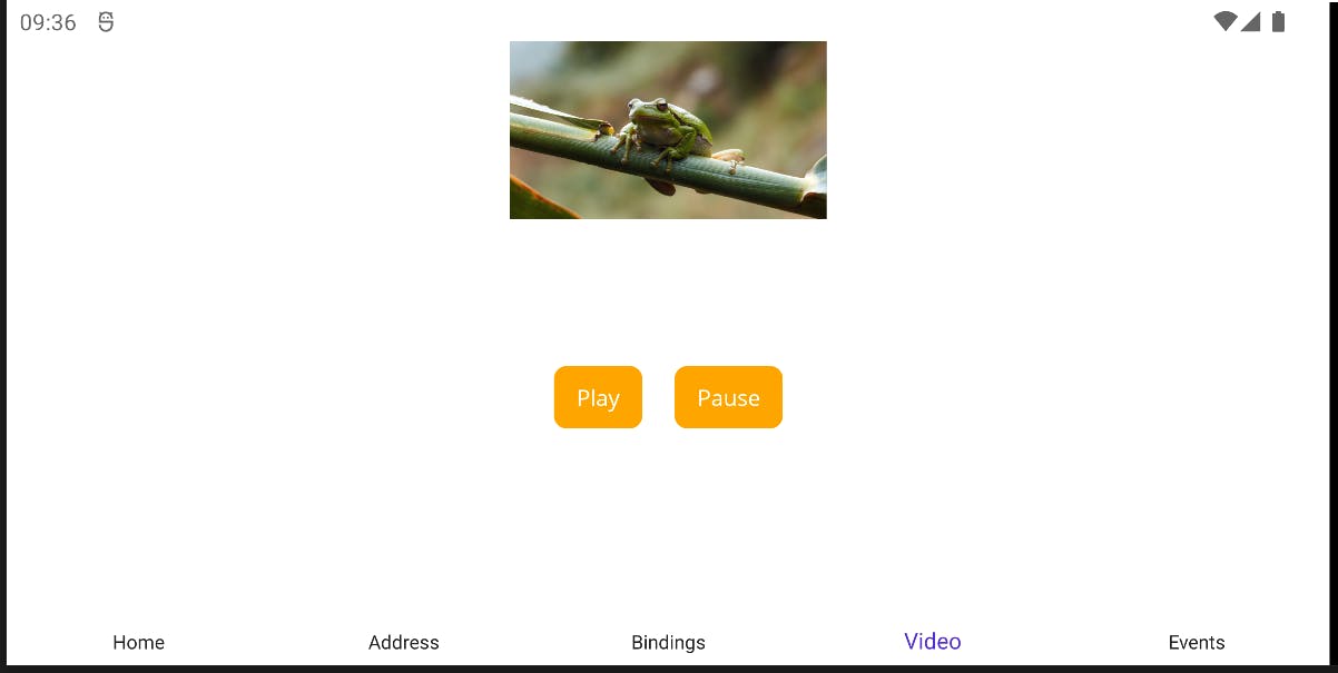
In Landscape mode, however, the video is extremely small and the buttons are still stacked horizontally below the video, which doesn't look great and provides a poor user experience.
This happens, because the same Layout is used for both Portrait and Landscape. Instead, let's move the video to the left side of the screen and stack the buttons vertically on the right side when the device is in Landscape mode to look like this:

First, let's have a look at the layout of the page and then make a few changes to it to achieve the desired result.
Page Layout
I have used a Grid to place the video at the top and the buttons at the bottom of the page, where the top row takes up one third of the available space and the bottom row takes up two thirds of the available space by defining them as follows: RowDefinitions="*,2*".
The MediaElement, which acts as the video player, is placed into the first row, first column of the Grid by setting the attached properties Grid.Row="0" and Grid.Column="0". This will be useful later on.
The buttons are located inside of a StackLayout which has its Orientation property set to "Horizontal", which means that they will be placed next to each other horizontally. The StackLayout itself is placed in the second row, first column of the Grid.
<?xml version="1.0" encoding="utf-8" ?>
<ContentPage xmlns="http://schemas.microsoft.com/dotnet/2021/maui"
             xmlns:x="http://schemas.microsoft.com/winfx/2009/xaml"
             xmlns:views="http://schemas.microsoft.com/dotnet/2022/maui/toolkit"
             x:Class="MauiSamples.Views.VideoPage"
             Shell.NavBarIsVisible="False">

  <Grid
    RowDefinitions="*,2*"
    ColumnDefinitions="*">

    <views:MediaElement
      Grid.Row="0"
      Grid.Column="0"
      x:Name="VideoPlayer"
      HorizontalOptions="Fill"
      Source="https://github.com/ewerspej/maui-samples/blob/main/assets/frog113403.mp4?raw=true"
      ShouldShowPlaybackControls="False" />

    <StackLayout
      Grid.Row="1"
      Grid.Column="0"
      VerticalOptions="Center"
      HorizontalOptions="Center"
      Spacing="20"
      Orientation="Horizontal">
      <Button
        HorizontalOptions="Center"
        Text="Play"
        Pressed="OnPlayPressed" />
      <Button
        HorizontalOptions="Center"
        Text="Pause"
        Pressed="OnPausePressed" />
    </StackLayout>

  </Grid>
</ContentPage>
This layout currently only looks great in Portrait mode, but not in Landscape as we've seen above. Let's fix it so that it looks prettier and more user friendly.
The best part is, we don't need to write a single line of C# code for this and we also don't need completely separate layouts, either. Instead, we can simply modify the existing layout based on the device orientation using styles and triggers. Let me show you how to do that next.
Hello, OrientationStateTrigger!
Time to introduce you to a type of trigger called OrientationStateTrigger. This trigger comes built-in with .NET MAUI (and Xamarin.Forms) and allows you to use Visual States and Styles to modify the visual appearance as well as the layout properties of a View.
Defining Styles and Triggers
For each Visual Element that we need to update based on the device orientation, we can add a Style inside of a ResourceDictionary which we add to our VideoPage:
<ContentPage.Resources>
  <ResourceDictionary>
    <Style TargetType="Grid" x:Key="VideoGridStyle">
    </Style>
    <Style TargetType="StackLayout" x:Key="ButtonStackStyle">
    </Style>
  </ResourceDictionary>
</ContentPage.Resources>
Inside of these styles, we can define the different Visual States that we want to use and attach an OrientationStateTrigger to each. These triggers are then used to apply the associated styles.
Each style receives a setter that defines the different visual states, in our case those visual states will be "Portrait" and "Landscape". Then, inside of each visual state, we can add the appropriate OrientationStateTrigger for the applicable device orientation:
<ContentPage.Resources>
  <ResourceDictionary>
    <Style TargetType="Grid" x:Key="VideoGridStyle">
      <Setter Property="VisualStateManager.VisualStateGroups">
        <VisualStateGroupList>
          <VisualStateGroup>
            <VisualState x:Name="Portrait">
              <VisualState.StateTriggers>
                <OrientationStateTrigger Orientation="Portrait" />
              </VisualState.StateTriggers>
            </VisualState>
            <VisualState x:Name="Landscape">
              <VisualState.StateTriggers>
                <OrientationStateTrigger Orientation="Landscape" />
              </VisualState.StateTriggers>
            </VisualState>
          </VisualStateGroup>
        </VisualStateGroupList>
      </Setter>
    </Style>
    <!-- ... -->
  </ResourceDictionary>
</ContentPage.Resources>
Once the triggers are setup, the setters of the visual states for our Layout elements can be added. We'll do this for the Grid and the StackLayout styles, one after the other, next.
Visual State Setters for the Grid
For our Grid, we need to change the RowDefinitions and ColumnDefinitions based on the device orientation. Instead of having two rows and a single column, we now need a single row and two columns, which we can achieve by adding the following setters:
<ContentPage.Resources>
  <ResourceDictionary>
    <Style TargetType="Grid" x:Key="VideoGridStyle">
      <Setter Property="VisualStateManager.VisualStateGroups">
        <VisualStateGroupList>
          <VisualStateGroup>
            <VisualState x:Name="Portrait">
              <VisualState.StateTriggers>
                <OrientationStateTrigger Orientation="Portrait" />
              </VisualState.StateTriggers>
              <VisualState.Setters>
                <Setter Property="RowDefinitions" Value="*,2*" />
                <Setter Property="ColumnDefinitions" Value="*" />
              </VisualState.Setters>
            </VisualState>
            <VisualState x:Name="Landscape">
              <VisualState.StateTriggers>
                <OrientationStateTrigger Orientation="Landscape" />
              </VisualState.StateTriggers>
              <VisualState.Setters>
                <Setter Property="RowDefinitions" Value="*" />
                <Setter Property="ColumnDefinitions" Value="2*,*" />
              </VisualState.Setters>
            </VisualState>
          </VisualStateGroup>
        </VisualStateGroupList>
      </Setter>
    </Style>
    <!-- ... -->
  </ResourceDictionary>
</ContentPage.Resources>
Visual State Setters for the StackLayout
The StackLayout on the other hand needs to change not only its orientation, but also its location inside of the Grid based on the device orientation.
For Portrait mode, the Orientation property must be set to "Horizontal" while it needs to be set to "Vertical" in Landscape mode. In Portrait mode, the StackLayout will be in the second row, first column of the Grid, while it needs to be in the first row, second column of the Grid in Landscape mode. We can achieve this by defining the following setters for the StackLayout:
<ContentPage.Resources>
  <ResourceDictionary>
    <!-- ... -->
    <Style TargetType="StackLayout" x:Key="ButtonStackStyle">
      <Setter Property="VisualStateManager.VisualStateGroups">
        <VisualStateGroupList>
          <VisualStateGroup>
            <VisualState x:Name="Portrait">
              <VisualState.StateTriggers>
                <OrientationStateTrigger Orientation="Portrait" />
              </VisualState.StateTriggers>
              <VisualState.Setters>
                <Setter Property="Orientation" Value="Horizontal" />
                <Setter Property="Grid.Row" Value="1" />
                <Setter Property="Grid.Column" Value="0" />
              </VisualState.Setters>
            </VisualState>
            <VisualState x:Name="Landscape">
              <VisualState.StateTriggers>
                <OrientationStateTrigger Orientation="Landscape" />
              </VisualState.StateTriggers>
              <VisualState.Setters>
                <Setter Property="Orientation" Value="Vertical" />
                <Setter Property="Grid.Row" Value="0" />
                <Setter Property="Grid.Column" Value="1" />
              </VisualState.Setters>
            </VisualState>
          </VisualStateGroup>
        </VisualStateGroupList>
      </Setter>
    </Style>
  </ResourceDictionary>
</ContentPage.Resources>
Applying the Styles
Last, but not least, we need to apply the styles that we just defined to the Grid and the StackLayout in our page. Note that the styles are named, which means that they must be explicitly assigned to a visual element in order to take effect:
<Grid
  Style="{StaticResource VideoGridStyle}">

  <views:MediaElement
    Grid.Row="0"
    Grid.Column="0"
    Margin="0"
    x:Name="VideoPlayer"
    HorizontalOptions="Fill"
    Source="https://github.com/ewerspej/maui-samples/blob/main/assets/frog113403.mp4?raw=true"
    ShouldShowPlaybackControls="False" />

  <StackLayout
    VerticalOptions="Center"
    HorizontalOptions="Center"
    Spacing="20"
    Style="{StaticResource ButtonStackStyle}">
    <Button
      HorizontalOptions="Center"
      Text="Play"
      Pressed="OnPlayPressed" />
    <Button
      HorizontalOptions="Center"
      Text="Pause"
      Pressed="OnPausePressed" />
  </StackLayout>

</Grid>
Important: In order to apply the styles correctly, we need to make some modifications to the existing views in our page:
The
RowDefinitionsandColumnDefinitionsassignments of theGridwill be removed, just like theOrientationas well as theGrid.RowandGrid.Columnsettings of theStackLayout. This is necessary, because property setters that are applied directly on aVisualElementalways take precedence over any applied styles, which would prevent the OrientationStateTriggers to update these properties using the defined styles.
The MediaElement itself does not receive any styles or additional property setters, because it already is set up correctly for both device orientations, which is why it keeps its original settings for Grid.Row and Grid.Column (remember when I wrote further up that setting both row and column properties will be useful later on - this is later on). It will always remain in the first row, first column - independent of the device orientation. This way, we can keep things simple.
Result
Now, when we run the app again and rotate the device into Landscape mode, the video will be located on the left side taking up much of the available vertical space, while the buttons are now stacked vertically on the right:
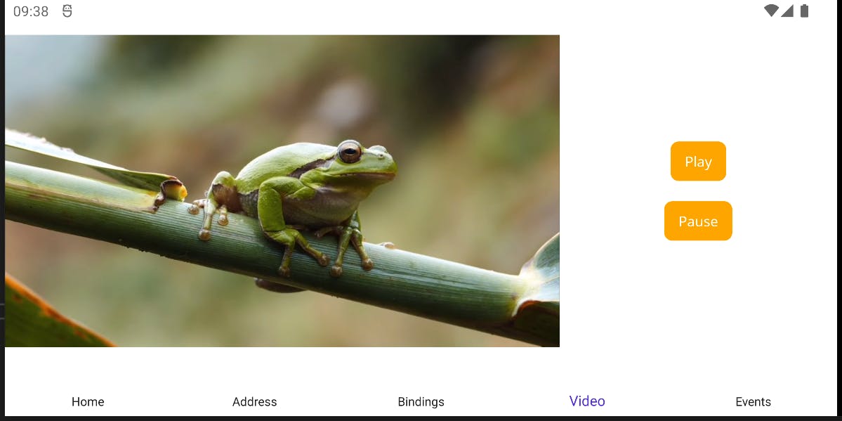
🏆 Awesome, this looks so much better! OrientationStateTrigger FTW! 💪
Conclusion and next steps
Using state triggers and styles, we can easily add responsive layouts to our app based on the device orientation and thus offer a rich user experience for both Portrait and Landscape modes - entirely in XAML, no C# code required.
Combining this approach with some other tricks as well as some platform-specific code, we can even build immersive user experiences, such as full-screen mode, which requires some additional work and will be covered in a separate article.
If you enjoyed this blog post, then follow me on LinkedIn, subscribe to this blog and star the GitHub repository for this post so you don't miss out on any future posts and developments.