

How to write a Custom Control for .NET MAUI using SkiaSharp
Let's develop a customizable Progress Bar step-by-step


Intro
Sometimes, when you're developing an app, you find yourself in need of a specific control but you just can't manage to find the right one, because the available ones do not offer some of the features that you're looking for. This happens to me quite often and in that case, I tend to just write up my own little custom control.
Building controls using just XAML in .NET MAUI (or Xamarin.Forms) is a common thing that most mobile developers frequently do. However, sometimes you need more control over the look and feel and for that you can use drawn controls instead of reusing existing XAML elements or platform-specific native controls.
In this blog post, I will demonstrate how you can easily draw up your own custom controls for .NET MAUI using SkiaSharp and what you need to do in order to make it reusable - all without needing to write custom handlers, mappers or renderers. Last but not least, I will also show you how Visual Studio 2022 17.4 helps you with creating a nuget package (.nupgk) that you can upload to nuget.org to share it with the world.
While you can use .NET MAUI's GraphicsView which provides a drawing canvas, I personally prefer drawing controls with SkiaSharp.
In this blog post, I am going to refer to a different GitHub repository than the usual one. Step-by-step, we will be building this Progress Bar control which I have already developed and published: github.com/ewerspej/epj.ProgressBar.Maui.
Goal
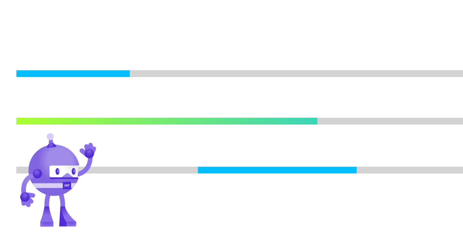
Let's develop a simple but customizable Progress Bar control that will look like this:

The colors of the base and the progress should be customizable. It will also be possible to set the width and height for the Progress Bar.
Setup
In order to begin, we need a new solution with two projects inside. The first one will be a new .NET MAUI App project which will serve as our test bed to see our custom control in action. The second one will be a .NET MAUI Class Library project. This is where we will actually implement our custom control.
Note: A common approach is to place the solution and the sample project in a separate folder, e.g.
sample, while the library project resides in its ownsrc(orsourceor whatever you prefer to call it) folder. The reason to do this is simple: We want to separate our sample code from our library, which makes it easier to navigate and maintain, but that's not a must, it's merely a matter of choice and convenience.
Sample Solution
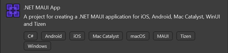
First, we create a new folder called ProgressBar and inside that, we create another folder called sample before we start up Visual Studio 2022 17.4 and create a new project by selecting .NET MAUI App from the templates:
In the next dialog, we choose the sample folder from before as the directory for our new project. We can place the solution and the project in the same folder here to keep the folder structure simple. We click our way through the project creation wizard and should end up with a folder structure similar to this:
- \ProgressBar\sample\ProgressBarSample
Note: As mentioned above, this is not a must, you can also leave out the
sampledirectory to keep the path short.
ProgressBar Project
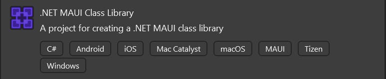
Now, we can add the project for the Progress Bar control in the separate src folder. With the solution still open in Visual Studio, we right click on it and select Add -> New Project. From the templates, we select .NET MAUI Class Library this time:
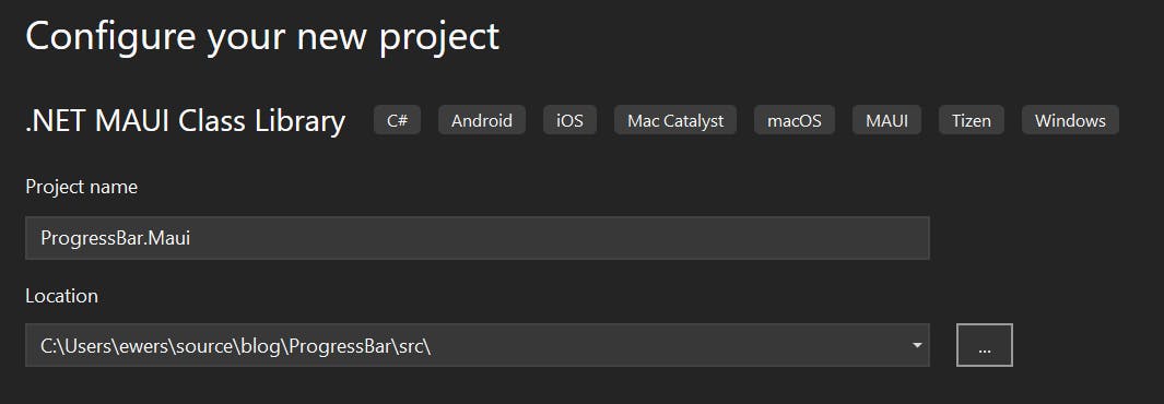
On the following page of the wizard we need to provide a name for the class library as well as a location. For the name, I will use ProgressBar.Maui, but this is just an example. Normally, you would choose some kind of appropriate package name. For the location, I will choose the src folder and select Create to finish the setup:
Once the class library project is created, we end up with a folder structure similar to this:
- \ProgressBar\sample\ProgressBarSample
- \ProgressBar\src\ProgressBar.Maui
Note: In our class library project, we will find a folder structure similar to that of a .NET MAUI App, with a Platform folder for platform-specific code, which can be used to call APIs on Android, iOS, etc. and to create platform-specific handlers, if necessary. In our case, we won't need any of that. Therefore, it's safe to remove the Platform folder and its contents, if you wish to do so.
In the ProgressBar.Maui project, let's rename the Class1.cs file to ProgressBar.cs and also change the class name to ProgressBar.
We also need to add a Project Reference to the ProgressBar.Maui project to our ProgressBarSample project so that we can use any classes from that in our App. To do this, right-click on ProgressBarSample and select Add -> Project Reference, then select the class library project.
Adding SkiaSharp
Next, we need to add SkiaSharp to our class library project. For this, we add the following packages in the NuGet package manager (right-click on the ProgressBar.Maui project and select Manage NuGet Packages):
- SkiaSharp.Views.Maui.Controls (version 2.88.3 at time of writing)
- SkiaSharp.Views.Maui.Core (version 2.88.3 at time of writing)
Once installed, we can use the SKCanvasView as a base class for our control. After that, our class should look like this:
using SkiaSharp.Views.Maui.Controls;

namespace ProgressBar.Maui;

// All the code in this file is included in all platforms.
public class ProgressBar : SKCanvasView
{
}
Handler Registration
Before we advance to the actual implementation, we need to register a handler for our control. This is required, because otherwise MAUI doesn't know how to render the control for each platform.
We don't actually need our own platform-specific handlers since we inherit directly from SKCanvasView without additional requirements. Therefore, we can conveniently use the existing SKCanvasViewHandler from SkiaSharp, because it takes care of everything for us already.
In order to be able register the handler for our control, we need to create a static class inside our ProgressBar.Maui project that I usually call Registration. Inside that class, we create an extension method called UseProgressHandler() where we add the handler to the MauiAppBuilder:
using SkiaSharp.Views.Maui.Handlers;

namespace ProgressBar.Maui;

public static class Registration
{
    public static MauiAppBuilder UseProgressBar(this MauiAppBuilder builder)
    {
        builder.ConfigureMauiHandlers(h =>
        {
            h.AddHandler<ProgressBar, SKCanvasViewHandler>();
        });

        return builder;
    }
}
This can now be used in our ProgressBarSample project's MauiProgram class as follows:
public static class MauiProgram
{
    public static MauiApp CreateMauiApp()
    {
        var builder = MauiApp.CreateBuilder();
        builder
            .UseMauiApp<App>()
            .UseProgressBar() //add this line
            .ConfigureFonts(fonts =>
            {
                fonts.AddFont("OpenSans-Regular.ttf", "OpenSansRegular");
                fonts.AddFont("OpenSans-Semibold.ttf", "OpenSansSemibold");
            });

        return builder.Build();
    }
}
That's it, we're all set up to actually implement our custom Progress Bar control.
Adding the control to XAML
Before implementing the details, let's already add our ProgressBar to a XAML Page or View, so that we can use that to see what we are actually developing. To do this, we simply import the namespace from our class library and add the control to the layout:
<?xml version="1.0" encoding="utf-8" ?>
<ContentPage xmlns="http://schemas.microsoft.com/dotnet/2021/maui"
             xmlns:x="http://schemas.microsoft.com/winfx/2009/xaml"
             xmlns:maui="clr-namespace:ProgressBar.Maui;assembly=ProgressBar.Maui"
             x:Class="ProgressBarSample.MainPage">

  <VerticalStackLayout
            Spacing="25"
            Padding="30,0"
            VerticalOptions="Center">

    <maui:ProgressBar
      WidthRequest="250"
      HeightRequest="5" />

  </VerticalStackLayout>

</ContentPage>
We cannot set any custom properties, yet, because we haven't actually implemented anything so far, but we will already provide values for the WidthRequest and HeightRequest that each control inherits from VisualElement so that our Progress Bar has a defined size.
Note: We're not going to implement additional sizing properties, our Progress Bar will simply size itself automatically based on the allocated size of the control.
Implementing the Progress Bar
Now, we can use the empty class that we created earlier to implement the drawing logic for our Progress Bar control.
Setting up the Canvas for drawing
Before we can draw anything, we need to set up our canvas. First, we add a few private fields to store the canvas and some additional information about our drawing surface:
public class ProgressBar : SKCanvasView
{
    // actual canvas instance to draw on
    private SKCanvas _canvas;

    // rectangle which will be used to draw the Progress Bar
    private SKRect _drawRect;

    // holds information about the dimensions, etc.
    private SKImageInfo _info;
}
All the drawing will be done in the OnPaintSurface() method, which we need to override it from our base class. That's where we actually set up our canvas and the drawing rectangle that will contain the progress bar:
protected override void OnPaintSurface(SKPaintSurfaceEventArgs e)
{
    base.OnPaintSurface(e);

    _canvas = e.Surface.Canvas;
    _canvas.Clear(); // clears the canvas for every frame
    _info = e.Info;
    _drawRect = new SKRect(0, 0, _info.Width, _info.Height);

    //...
}
Every time OnPaintSurface() gets called our control will be drawn. Therefore, we request the canvas to draw on and call Clear() on it. Otherwise, we would draw on top of what has been drawn already before.
Adding the Progress and Color properties
Next, let's add the properties for the progress value and the colors. Our Progress property will be of type float, because SkiaSharp uses float and thus we don't need to use any typecasts. We also add BaseColor and ProgressColor properties of type Color (Microsoft.Maui.Graphics.Color). Our properties will be bindable and should look like this:
public float Progress
{
    get => (float)GetValue(ProgressProperty);
    set => SetValue(ProgressProperty, value);
}

public Color ProgressColor
{
    get => (Color)GetValue(ProgressColorProperty);
    set => SetValue(ProgressColorProperty, value);
}

public Color BaseColor
{
    get => (Color)GetValue(BaseColorProperty);
    set => SetValue(BaseColorProperty, value);
}

public static readonly BindableProperty ProgressProperty = BindableProperty.Create(
    nameof(Progress), typeof(float), typeof(ProgressBar), 0.0f, propertyChanged: OnBindablePropertyChanged);

public static readonly BindableProperty ProgressColorProperty = BindableProperty.Create(
    nameof(ProgressColor), typeof(Color), typeof(ProgressBar), Colors.Orange, propertyChanged: OnBindablePropertyChanged);

public static readonly BindableProperty BaseColorProperty = BindableProperty.Create(
    nameof(BaseColor), typeof(Color), typeof(ProgressBar), Colors.LightGray, propertyChanged: OnBindablePropertyChanged);
In order to be able to update the drawn control whenever any of the properties change, we need to call InvalidateSurface() ourselves which we do in a PropertyChanged event handler:
private static void OnBindablePropertyChanged(BindableObject bindable, object oldValue, object newValue)
{
    ((ProgressBar)bindable).InvalidateSurface();
}
Note: SkiaSharp renders the entire control each time
OnPaintSurface()is called. This usually happens, when the surface gets invalidated. In order to avoid unnecessary (and expensive) rendering cycles, it's important to limit how oftenInvalidateSurface()gets called.
Now, we can start drawing the actual control.
Drawing the base
First, we draw the base. For this, we create a new method DrawBase() so that our OnPaintSurface() method doesn't get too crowded. In that new method, we create an instance of SKPath and we add our _drawRect to it, because that's the shape we want to draw as a path. Then, we draw the path by calling DrawPath() on the _canvas and pass the path as well as a SKPaint object which holds information about how to draw the base. We want to fill the entire rectangle with the BaseColor:
private void DrawBase()
{
    using var basePath = new SKPath();

    basePath.AddRect(_drawRect);

    _canvas.DrawPath(basePath, new SKPaint
    {
        Style = SKPaintStyle.Fill,
        Color = BaseColor.ToSKColor(),
        IsAntialias = true
    });
}
Now, we can call DrawBase() at the end of our OnPaintSurface() override:
protected override void OnPaintSurface(SKPaintSurfaceEventArgs e)
{
    base.OnPaintSurface(e);

    _canvas = e.Surface.Canvas;
    _canvas.Clear(); // clears the canvas for every frame
    _info = e.Info;
    _drawRect = new SKRect(0, 0, _info.Width, _info.Height);

    DrawBase();
}
When we run our app, we will already see a gray bar:

Great. Let's add some progress!
Drawing the progress
Similar to drawing the base, we will create a new method called DrawProgress(). We will add a rectangle and a SKPaint again, but this time we use the Progress property to determine the width the of the bar which will indicate the actual progress:
private void DrawProgress()
{
    using var progressPath = new SKPath();

    var progressRect = new SKRect(0, 0, _info.Width * Progress, _info.Height);

    progressPath.AddRect(progressRect);

    _canvas.DrawPath(progressPath, new SKPaint
    {
        Style = SKPaintStyle.Fill,
        IsAntialias = true,
        Color = ProgressColor.ToSKColor()
    });
}
In order to draw the actual progress, we must not forget to call our DrawProgress() method in OnPaintSurface():
protected override void OnPaintSurface(SKPaintSurfaceEventArgs e)
{
    base.OnPaintSurface(e);

     _canvas = e.Surface.Canvas;
    _canvas.Clear(); // clears the canvas for every frame
    _info = e.Info;
    _drawRect = new SKRect(0, 0, _info.Width, _info.Height);

    DrawBase();
    DrawProgress();
}
Important:
DrawProgress()must be called afterDrawBase(), because on a canvas, everything is drawn on top of each other. If we would make the calls the other way around, we wouldn't be able to see the progress being drawn, because the base would cover it entirely.
Before running the app again, let's update our XAML and set the Progress property to a value between 0.0 and 1.0, e.g. 0.4:
<maui:ProgressBar
  WidthRequest="250"
  HeightRequest="5"
  Progress="0.4"/>
Now, when we run the app again, we will see the ProgressBar filling 40% of its entire width:

The progress color is Orange, because that's the default value we provided to our BindableProperty.
We can change this by setting the ProgressColor property in our XAML to some other color:
<maui:ProgressBar
  WidthRequest="250"
  HeightRequest="5"
  Progress="0.4"
  ProgressColor="DeepSkyBlue"/>
Then it will look like this (thanks to Hot Reload, we don't even need to restart the app to do this):

🤩 Awesome, our control is ready for use. The Progress value and any of the other properties can be used to bind to a ViewModel or to be set to dynamic or static resources.
Note: You can find the full code including color gradients and animations on GitHub. The complete control is also available on nuget.org.
NuGet
Sharing is caring! In the Open Source realm it's great to sometimes give back to the Community. Personally, I find it rewarding to contribute something useful. It also helps with development projects and to show some of your skills.
If you happen to feel the urge to share your own custom control but struggle with setting up a .nuspec file and create a .nupkg file using the NuGet CLI, fear no more, Visual Studio 2022 17.4 comes to the rescue 🦸🏽♂️.
When you right-click on the MAUI Library project (ProgressBar.Maui in our case), select Properties and navigate to the Package section. Turn on package creation by enabling the checkbox where it says Generate NuGet package on build. Set a couple of more properties like the version, title, description and authors and you're good to go:
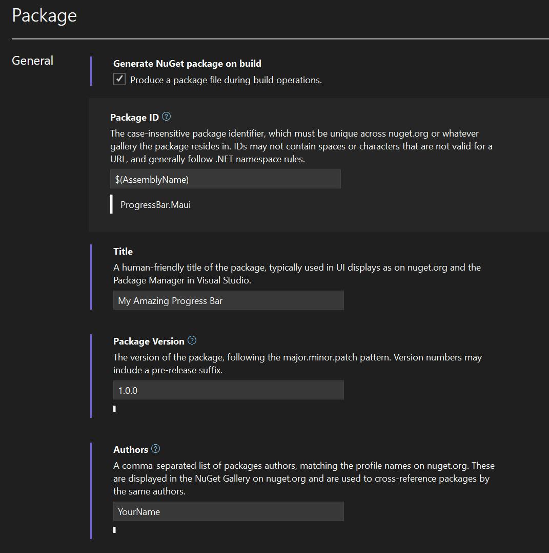
These settings will actually just update the .csproj file and add the following properties to the main PropertyGroup:
<GeneratePackageOnBuild>True</GeneratePackageOnBuild>
<Title>My Amazing Progress Bar</Title>
<Version>1.0.0</Version>
<Authors>YourName</Authors>
<Description>A really cool ProgressBar for .NET MAUI</Description>
When you create a build, Visual Studio will automatically generate a NuGet package for you in the bin folder, which can be used to upload and share your custom control on nuget.org.
Important: Always use
Releasemode for NuGet packages, never uploadDebugversions to nuget.org!
Conclusions and next steps
As I have shown, it is very easy to quickly develop customizable controls by drawing on a canvas without the need of any platform-specific handlers or mappers for .NET MAUI (or renderers when you're familiar with Xamarin.Forms) using SkiaSharp. Visual Studio even makes it easy to share your custom controls with the world without a lot of hazzle.
In future blog posts, I will write about using MAUI Graphics and ways to customize and extend existing controls. In the meanwhile, if you would like to learn more about drawn controls in .NET MAUI, you can also check out Javier Suárez Ruiz's session from .NET Conf 2021.
If you enjoyed this blog post, then follow me on LinkedIn, subscribe to this blog and star the GitHub repository for this post so you don't miss out on any future posts. Don't forget to share this with your friends and colleagues who are interested in learning about this topic. Thank you for reading and sharing 💝