


Intro
I absolutely love dark app themes. As a person working a lot in front of computer screens and using mobile devices a lot, I have come to appreciate the ease on the eyes that Dark (or Night) Modes of software and mobile apps provide. In this blog post, I would like to show a simple way to implement this wonderful feature in order to provide a flawless user experience to your app's users without having to manipulate a ResourceDictionary at run-time.
As the convention goes these days, users should have the option to choose whether to use
a Dark or Light Theme or to simply follow the system setting. .NET MAUI conveniently supports "Light" and "Dark" App Themes right out of the box. The sample Shell app even comes pre-configured with some styles that use the built-in markup extension AppThemeBinding. Let's explore how to take advantage of this. The code for this sample implementation can be found in my GitHub repository.
The UserAppTheme property and Styles
The Application class (App.xaml.cs) comes with a property of the enum type AppTheme called UserAppTheme which can be set to change the current theme:
// dark theme
UserAppTheme = AppTheme.Dark;

// light theme
UserAppTheme = AppTheme.Light;

// follow system default
UserAppTheme = AppTheme.Unspecified;
Coupled with the AppThemeBinding markup extension inside some Style elements in a ResourceDictionary (e.g. defined in the Styles.xaml file) this would already to suffice to set the theme once and be done:
<Style TargetType="ContentPage" ApplyToDerivedTypes="True">
    <Setter Property="BackgroundColor" Value="{AppThemeBinding Light={StaticResource White}, Dark={StaticResource Black}}" />
</Style>
Our app would now just be either shown with a black or white page background depending on the hard-coded value for the UserAppTheme property. This is already pretty neat, but we want to let the user decide. So let's do that.
Our own Theme class
In order to provide a meaningful user experience, we are going to implement our own Theme class which holds the AppTheme as well as a DisplayName.
The advantages of this class will become apparent further down. Hint: The DisplayName could be used in advanced scenarios to show a translated string depending on the selected language, but we won't cover localization of string resources in this article.
public sealed class Theme
{
    public static Theme Dark = new(AppTheme.Dark, "Night Mode");
    public static Theme Light = new(AppTheme.Light, "Day Mode");
    public static Theme System = new(AppTheme.Unspecified, "Follow System");

    public static List<Theme> AvailableThemes { get; } = new()
    {
        Dark,
        Light,
        System
    };

    public AppTheme AppTheme { get; }
    public string DisplayName { get; }

    private Theme(AppTheme theme, string displayName)
    {
        AppTheme = theme;
        DisplayName = displayName;
    }
}
Since the theme can usually be selected in a Settings section of an app, we will also implement a small SettingsService class.
The SettingsService
In this example, we simply create a small class that implements the INotifyPropertyChanged interface and use it as a singleton for convenience. I am skipping advanced topics like Dependency Injection and MVVM Code Generation.
public class SettingsService : INotifyPropertyChanged
{
    private static SettingsService _instance;
    public static SettingsService Instance => _instance ??= new SettingsService();

    private SettingsService()
    {
        // set the default (in advanced scenarios, this could be read from the preferences)
        Theme = Theme.System;
    }

    private Theme _theme;
    public Theme Theme
    {
        get => _theme;
        set
        {
           if(_theme == value) return;
            _theme = value;
           OnPropertyChanged();
        }
    }

    //...
}
We are going to use the SettingsService to hold the information about the current app theme, but it can also be extended to actually store the theme to the app's preferences. To see how this can be done, check out the repository with the sample code further down.
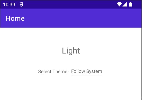
A sample UI
Now that we have the Theme and SettingsService classes, we can create a simple UI that will update its styling based on the selected AppTheme. We can add the following XAML to our MainPage (or any other Page for that matter) and bind to the SettingsService.Instance singleton and the DisplayName of our Theme class:
  <ContentPage.Resources>
    <ResourceDictionary>
      <Style TargetType="Label" x:Key="LabelStyle">
        <Setter Property="Text" Value="{AppThemeBinding Light=Light, Dark=Dark}" />
      </Style>
    </ResourceDictionary>
  </ContentPage.Resources>

  <Grid>
    <VerticalStackLayout
      Spacing="25"
      Padding="30,0"
      Margin="0,50,0,0"
      VerticalOptions="Start">

      <Label
        HorizontalOptions="Center"
        Style="{DynamicResource LabelStyle}"
        FontSize="Title"/>

      <HorizontalStackLayout
        VerticalOptions="Center"
        HorizontalOptions="Center">
        <Label
          VerticalOptions="Center"
          Text="Select Theme: " />

        <!-- Note: We are binding to the SettingsService singleton and the DisplayName of the Theme -->
        <Picker
          VerticalOptions="Center"
          ItemsSource="{Binding Source={x:Static models:Theme.AvailableThemes}}"
          ItemDisplayBinding="{Binding DisplayName}"
          SelectedItem="{Binding Path=Theme, Source={x:Static services:SettingsService.Instance}}"/>
      </HorizontalStackLayout>

    </VerticalStackLayout>
  </Grid>
We also need to define a few more styles in our main ResourceDictionary which lives in the Styles.xaml file of our project, but they can also be defined anywhere else:
  <Style TargetType="ContentPage" ApplyToDerivedTypes="True">
    <Setter Property="BackgroundColor" Value="{AppThemeBinding Light={StaticResource White}, Dark={StaticResource Black}}" />
  </Style>

  <Style TargetType="Label">
    <Setter Property="TextColor" Value="{AppThemeBinding Light={StaticResource Gray500}, Dark={StaticResource White}}" />
  </Style>

  <Style TargetType="Picker">
    <Setter Property="TextColor" Value="{AppThemeBinding Light={StaticResource Gray500}, Dark={StaticResource White}}" />
  </Style>
This should roughly look like this:
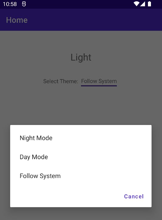
At the moment, nothing will actually happen when we tap on the Picker and select any of the Themes, because we still need to wire up the SettingService with the App's UserAppTheme property. Let's do that next.
Bringing it all together
The final step is to subscribe to the PropertyChanged event of our SettingsService in order to be able to react to changes in the settings. We will do this from within the App.xaml.cs, because that's where the UserAppTheme property lives:
public App()
{
    InitializeComponent();
    MainPage = new AppShell();

    // let's set the initial theme already during the app start
    SetTheme();

    // subscribe to changes in the settings
    SettingsService.Instance.PropertyChanged += OnSettingsPropertyChanged;
}

private void OnSettingsPropertyChanged(object sender, PropertyChangedEventArgs e)
{
    if (e.PropertyName == nameof(SettingsService.Theme))
    {
        SetTheme();
    }
}

private void SetTheme()
{
    UserAppTheme = SettingsService.Instance?.Theme != null
                 ? SettingsService.Instance.Theme.AppTheme
                 : AppTheme.Unspecified;
}
Essentially, what we are doing here is to respond to changes in the settings directly. This is possible, because our SettingsService implements the INotifyPropertyChanged interface.
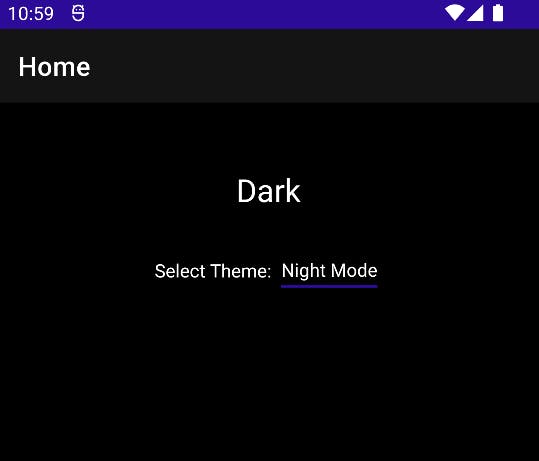
Running the app
Finally, we can run the app and select the App Theme during run-time, which is pretty awesome:
Conclusion and further writing
.NET MAUI comes with a lot of functionality out of the box and ready to use. I hope this blog post gives you an idea of how to provide an easy way to add a Dark Mode to your app and let your users select their preferred App Theme.
In future posts, I will show more advanced topics like wiring up the Picker control with localized strings, creating custom components and sharing them via nuget.org, as well as using MVVM Code Generation to your advantage to reduce. Stay tuned!
If you enjoyed this blog post, you may want to follow me on LinkedIn, subscribe to this blog and star the GitHub repository for this post.
Note: At the time of writing, I have used Visual Studio 2022 17.4 Preview 2.1 and .NET 7 RC1.